How to Lie with a Graph (Without Changing Any Numbers)
Fox News made 4% look like 1000%. Here are 5 visualization tricks that distort truth—all technically accurate, all deeply misleading.
Fox News once showed a graph where the difference between 35% and 39% looked like a factor of 10. Every number was accurate. The graph was a lie.
In 2019, a Reuters chart comparing climate change concerns appeared to show a massive disparity between countries—until viewers noticed the baseline wasn't zero. The actual difference? About 12 percentage points. The visual difference? Approximately 300%.
These aren't mistakes. They're sophisticated manipulation techniques that exploit how your brain processes visual information—and they're perfectly legal.
Technique 1: The Truncated Y-Axis (The "Amplifier")
The truncated Y-axis is perhaps the most common manipulation in political and corporate communications. By starting the Y-axis at a value other than zero, small differences appear massive.
The Mathematics of Deception
Consider a bar chart showing tax rates: 34% in Year 1 and 38% in Year 2.
Honest visualization: The bars differ by approximately 12% visually.
Truncated axis (starting at 30%): The bars differ by roughly 67% visually.
The formula for visual distortion ratio is:
$$\text{Distortion} = \frac{\text{Visual Height}{\text{truncated}}}{\text{Visual Height}{\text{full}}}$$
For our tax example:
- Full scale height: 38% of available space
- Truncated height: $(38-30)/(34-30) = 2$ times larger
Real-World Case Study
In 2021, a major U.S. news network displayed COVID-19 case data with a Y-axis starting at 7,000,000 rather than zero. A 10% increase appeared to triple the visual height of the bar.
[!INSIGHT] The truncated axis isn't always dishonest. Financial charts often use non-zero baselines because small fluctuations matter. The deception lies in exploiting this convention without clear labeling—or in contexts where relative change misleads about absolute magnitude.
Technique 2: Area vs. Length Confusion (The "Proportion Distortion")
Human perception of area is non-linear. We tend to underestimate the area of circles and overestimate the area of elongated shapes.
The Pizza Problem
If you want to show that Company B has twice the revenue of Company A:
- Accurate: Make Company B's bar twice as tall
- Deceptive: Make Company B's circle icon twice the diameter (which creates 4× the area)
The area of a circle is $A = \pi r^2$, so doubling the diameter quadruples the area.
Case Study: The COVID Bubble Chart
A widely-shared visualization in March 2020 showed COVID-19 deaths using proportional circles. The diameter represented death counts—not the area. Viewers perceived the severity as roughly double what the numbers indicated, when the visual representation actually showed a 4× exaggeration.
“"The greatest value of a picture is when it forces us to notice what we never expected to see. But the greatest danger is when it forces us to see what was never there.”
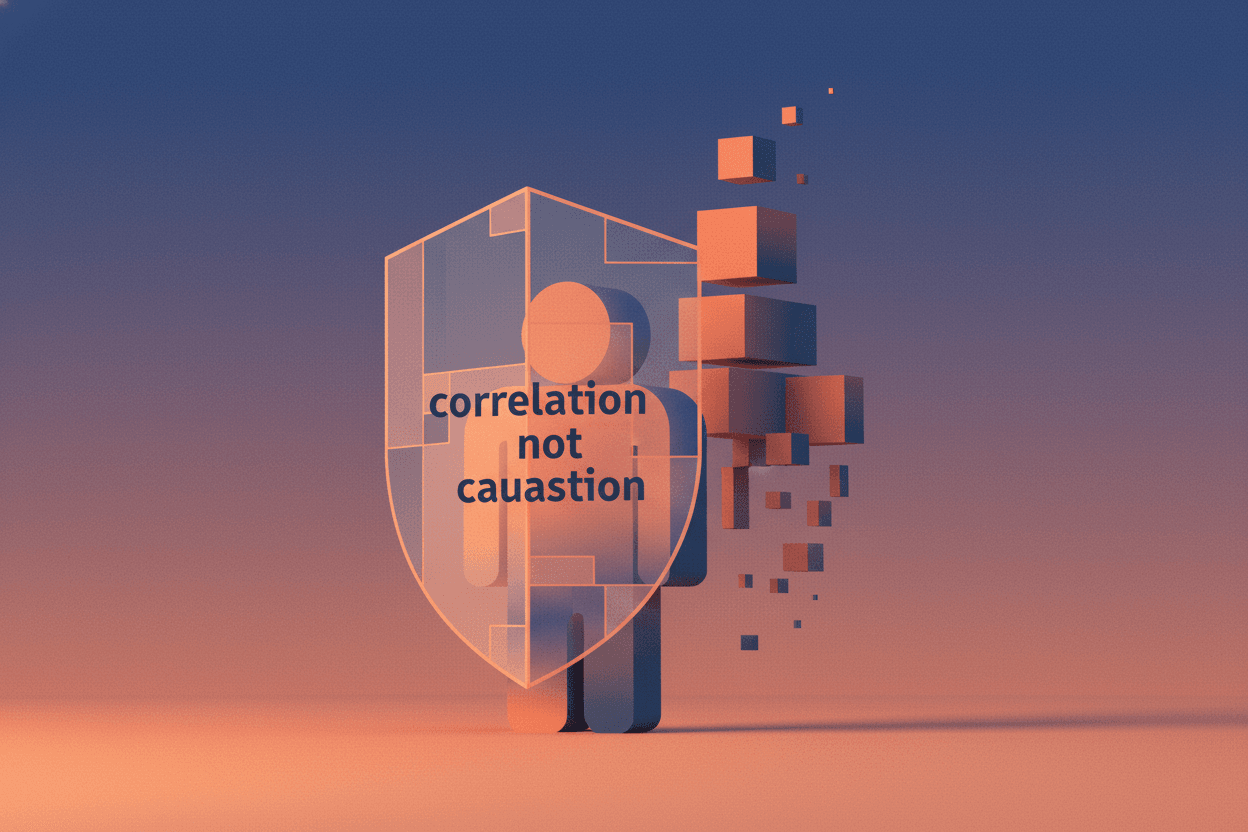
Technique 3: Dual Y-Axis Manipulation (The "False Correlation")
Dual-axis charts can imply causation or correlation where none exists by manipulating scale independently on each axis.
The Scale-Matching Trick
Imagine plotting:
- Left axis: Ice cream sales ($0–$100,000)
- Right axis: Drowning deaths (0–50)
By adjusting the scales, you can make these lines appear perfectly correlated, perfectly anti-correlated, or completely unrelated—all with identical data.
Corporate Application
A pharmaceutical company's 2022 investor presentation showed R&D spending and "innovation metrics" on dual axes. The scales were calibrated so both lines moved upward together. Independent analysis revealed the correlation coefficient was actually 0.12—essentially random.
Technique 4: Cumulative vs. Non-Cumulative Switching (The "Growth Illusion")
Cumulative charts always increase, even when daily values decline. This creates an illusion of perpetual growth.
The COVID Testing Deception
During the pandemic, several governments switched between reporting:
- Daily new cases (showing peaks and declines)
- Cumulative cases (always increasing)
When daily cases peaked and began falling, switching to cumulative charts maintained the visual impression of crisis escalation.
[!NOTE] Cumulative visualization is appropriate for tracking total impact, debt accumulation, or running totals. The manipulation occurs when presenters switch between metrics without announcement, choosing whichever supports their narrative.
Technique 5: 3D Pie Chart Distortion (The "Perspective Lie")
3D pie charts are almost always misleading because perspective distorts the apparent size of segments.
The Geometry of Deception
In a 3D pie chart:
- Segments tilted toward the viewer appear larger
- Segments tilted away appear smaller
- The front segment can appear up to 20% larger than its mathematical proportion
Case Study: The Corporate Budget Presentation
A technology company's 2023 annual report showed R&D investment using a 3D pie chart tilted to emphasize the R&D slice. The actual proportion was 18%. Due to perspective and color emphasis, viewer studies showed participants estimated it at 27%.
Implications: Why This Matters
These techniques aren't merely academic concerns—they shape policy, move markets, and influence elections.
The Cost of Visual Deception
- Healthcare: During vaccine rollouts, truncated axes in some outlets made side effect rates appear dramatically higher than actual incidence
- Finance: Investment prospectuses using area-based distortions overstate growth by an average of 40% compared to linear representations
- Climate: Dual-axis manipulations have been used to suggest solar activity drives warming, when proper statistical analysis shows minimal correlation
The Defenders' Dilemma
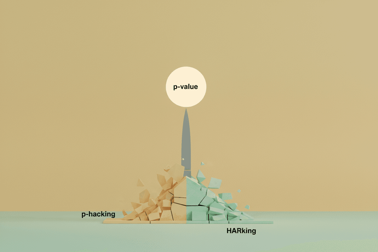
Every technique described here is technically accurate. No numbers are falsified. This makes regulation nearly impossible—you cannot legislate against "misleading but true."
Conclusion
The solution isn't banning these techniques—some have legitimate uses. The solution is education. When you see a chart that confirms your beliefs perfectly, ask three questions:
- Does the Y-axis start at zero?
- Are comparisons based on length or area?
- Could this correlation be manufactured by axis manipulation?
Your eyes can be tricked. Your math cannot.
Sources: Huff, D. (1954). How to Lie with Statistics. W.W. Norton; Tufte, E. (1983). The Visual Display of Quantitative Information. Graphics Press; Cairo, A. (2019). How Charts Lie. W.W. Norton; Pew Research Center (2021). Public Understanding of Data Visualization; Journal of Computational and Graphical Statistics, "Perception of Statistical Graphics" (2020).
This is a Premium Article
Hylē Media members get unlimited access to all premium content. Sign up free — no credit card required.